Quick Design Analysis
Even if you have a brilliant copy that is:
- clear
- customer focused
- free of jargon, buzzwords and superlatives
…it won’t be effective if you have:
- visual clutter
- misaligned elements
- poor text formatting
- walls of text
- too many highlights
- annoying pop-ups
Here are some common characteristics typically found in high-converting websites. Even though their designs may be different, I’ve seen these websites usually stick to these rules.
🔓 1 : Allow Some Breathing Space
If your Landing Page feels overwhelming, double the padding and I think you'll be pleasantly surprised.
When in doubt… Double the padding…
Whitespace isn’t just breathing room for your content, it’s breathing room
for your potential customer.
Digestible content improves focus and clarifies what you’re offering.

VS

Keep vertical spacing even
The vertical padding between your Landing Page section dividers is often
overlooked:

🔓 2 : Don't get too fancy 💁🏼♀️
Parallax scrolling, scroll transitions, custom cursors, colour switchers...
While they all have their time and place, avoid dwelling on them if you are new to Landing Pages or not making sales.
Instead, spend your time on polishing your copywriting
This will be way more beneficial in the long run.
When your sales start rolling in, then you can indulge in a little bit of flair.
🔓 3 : Engaging CTA Button
Remember: you're excited to share your product or service!
👉 Click Here
👉 Sign Up
👉 Buy Now
The above examples are too bland.
Instead, use a STRONG command verb in your CTA, i.e the following actionable phrases.
👉 Request a Call from Our Agents
👉 Discover the Wonders of____
👉 Get your First Lesson Now
👉 Reserve To get Early Bird Discount $197 $19
Don't afraid to repeat the same CTA button over and over again across your sales page as you want to emphasise your audience repeatedly on the action that they have to take.
Increase the contrast of your CTA button.
Using a highly contrasted button background, you can create striking CTA buttons.

You could consider selecting a distinct colour that stands out more compared to the rest of your colour scheme – for instance, a striking blue button below.

BIG ANNOYING BUTTON RAISES
Conversions By 25%! – Research by Russel Brunson

So, how do you make an engaging and flashy CTA button?
Well, there are few options below:
To use Elementor AI for adding custom CSS to a button in order to create a flashy button, follow these steps:
How to use it?
- Select Your Button Widget: In your Elementor editor, click on the button widget that you wish to customize.
- Access the Advanced Tab: Once the button widget is selected, navigate to the “Advanced” tab, which you will find in the Elementor panel on the left-hand side of the screen.
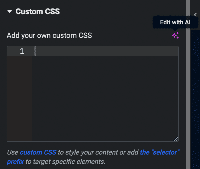
- Open Custom CSS Section: In the “Advanced” tab, locate and click on the “Custom CSS” section.
- Engage Elementor AI: Click on “Code with AI” or the three-star icon (it might appear as “Edit with AI” initially and change to the Elementor AI icon upon subsequent uses).

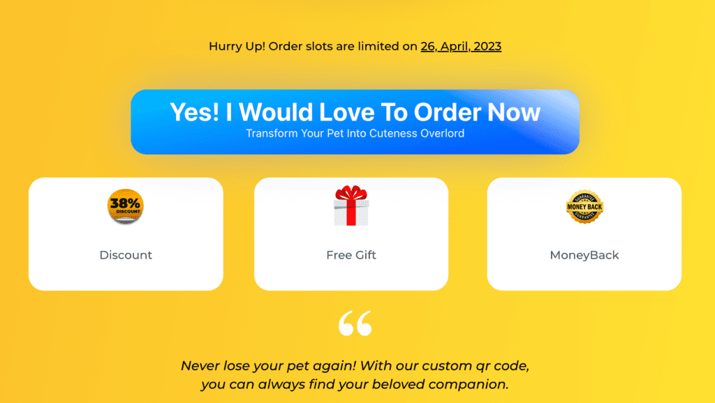
- Enter Your Prompt: In the text box or search box that appears, enter a prompt describing the flashy effect you want. For example, you might enter “Make this button flash on hover” or another description of the effect you desire.

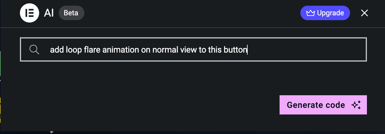
- Generate Code: Click the “Generate code” button. Elementor AI will then create the necessary custom CSS code based on your prompt.
- Insert Code: After the code has been generated, click the “Insert” button to apply the custom CSS to your button widget.
Uiverse.io is your go-to source for UI elements created with CSS. You can craft, share, and use custom elements from talented creators too. They have a top creators list, filled with design inspiration, and you can just grab the code and roll with it.
How to use it?
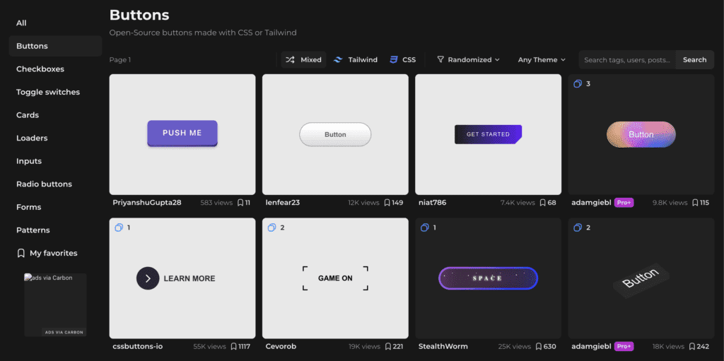
- Choose UI Buttons Element: Browse the library or use the search function to find a UI element that fits your design needs.

- Get the Code: If the element meets your requirements, click on the “Get Code” button to reveal the associated HTML/CSS code.
- Copy the Code: Highlight and copy the provided HTML & CSS code.
- Open ChatGPT: Ask ChatGPT to add the Ahref link to the button like the following prompt: Please add this link (https://mysite.com/next-step) to the HTML code:
- Open Elementor in WordPress: Navigate to your WordPress site and open the specific page you’re modifying with Elementor Pro.
- Drag the HTML Widget: In the Elementor side panel, locate the ‘HTML’ widget under the ‘General’ widgets category. Drag-and-drop it into the desired area on your website layout.
- Paste the Code Into HTML Widget: Paste the copied HTML code generated by ChatGPT into the HTML code area.
- Apply Custom CSS: Then, under the ‘Advanced’ tab in the Elementor side panel. Here, you’ll find a ‘Custom CSS’ section. You can insert the CSS code here.
Use Canva to design a button with animation and then export it into GIF format

Install any of the following Elementor addons to copy its animated CTA buttons:
🔓 4 : Visual is King 👑
Good imagery builds trust, and trust is the foundation for conversions. In addition, visuals are processed faster and remembered better than text-based content.
When it comes to your visuals
– spend your 💵💵💵 and ⏰ to design appealing visuals which add the following elements:
👉 Invoke positive emotion
👉 Matching the colour palette of your website
👉 Curiosity, engaging and mystery
👉 Personal photos/studio photos to establish trust
Which one is better?
Using stock photos can appear inauthentic to customers, so using real photos and screenshots can be more effective.
Personalized Graphics

VS
Stock Photos

Visuals can make information clearer and more engaging, but curiosity is the key. Take a look at the blurred graphics below:


“Having fewer images of higher quality, each with its own strategic objective, is better than having numerous images that provide little to no value.”
Please refer to the compilation of graphics resources in the next topic.
🔓 5 : Enhance text & Improve Readability
Use underline, capitalize, highlight, and bold to emphasize specific points. Another thing is that body text (I’m not talking about heading) must always be left indented as research states that it increases readability.
Additionally, avoid using shadow effects on your body text; it’s unclear why some individuals choose to include drop shadows beneath their text.
Example 1: Which one is better, left or right?
NEW breakthrough solution allows you to Immediately GROW client engagement and SELL more products by creating a state of the art mobile application in 60 MINUTES OR LESS without ANY coding knowledge!⭐⭐⭐⭐⭐
Finally Revealed… NEW breakthrough solution allows you to IMMEDIATELY GROW client engagement and SELL more products by creating a state of the art mobile application in 60 MINUTES OR LESS without ANY coding knowledge! ⭐⭐⭐⭐⭐
To achieve this, you can either add HTML & CSS code to the text editor widget or you can click toggle toolbar to expand the customization selection
Text editor:

HTML editor:
Finally Revealed...
NEW breakthrough solution
allows you to Immediately
GROW
client engagement and SELL more products by creating a
state of the art mobile application.
in 60 MINUTES OR LESS
without ANY coding knowledge!
Example 2: Which one is better, left or right?
Launch your business in the US from any country, in minutes.
HTML editor:
Launch your business in the US from any country, in minutes.
.gradient-text {
background: linear-gradient(to right, #FFC107, #FF5722);
-webkit-background-clip: text;
-webkit-text-fill-color: transparent;
}
Highlight Whenever It's Important
Highlight 1
HTML editor:
Finally Revealed... NEW breakthrough solution allows you to IMMEDIATELY GROW client engagement and SELL more products by creating a state of the art mobile application in 60 MINUTES OR LESS without ANY coding knowledge! ⭐⭐⭐⭐⭐
.highlight{
background-image: linear-gradient(-100deg, rgba(255, 255, 255, 0), yellow 85%, rgba(255, 255, 255, 0));
}
Highlight 2
This Program Has Tons of VALUES :
HTML editor:
This Program Has Tons of VALUE :
.highlight-container, .highlight2 {
position: relative;
color: black;
}
.highlight-container {
display: inline-block;
}
.highlight-container:before {
content: " ";
display: block;
height: 100%;
width: 105%;
margin-left: -3px;
margin-right: -3px;
position: absolute;
background: #ffd500;
transform: rotate(2deg);
top: -1px;
left: -1px;
border-radius: 20% 25% 20% 24%;
padding: 10px 3px 3px 10px;
}
Use bullet points to summarize your copy whenever necessary.

🔓 6 : One Page, One Objective
When it comes to your sales page, it's crucial to keep your objective crystal clear. Unless you're setting up a corporate or storefront website, your sales page should have one primary goal. We don't want any distractions like mega menus, search bar or any unnecessary links that lead people away from taking the next step in your conversion process. You want to keep your visitors engaged and focused on the main objective, which is to get them to buy your products or services. So, avoid distractions that lead them astray. Instead, create a seamless flow that directs them towards taking that desired action.

🔓 7 : Dual Tone Color Scheme
Creating a website involves making sure everything looks good and matches together especially the colors. This is not just about the big parts like the headlines or the background but also the other parts, like images and icons, which we call graphics.
Now, there's a simple trick that a lot of successful websites use: they pick only two main colors for their whole website. This is known as a "dual-tone color scheme." Research shows that websites using just two main colors tend to do a better job at retaining visitors' attention as it add contrast to the web page.
However, this doesn’t mean using only two colors like blue and orange. Instead, choose multiple shades of blue and orange as part of your color scheme.You can use these colors in either light-mode or dark-mode appearances. This is just a guide and don’t be afraid of breaking this rule; you can also choose to introduce a new color every now and then. For example, your Call To Action button might want to have a red or any other distinct color so that it pops out.


Hello everyone, feel free to ask any question here 🙂
ada buat servis untuk buat landing page?
some of the video is not working
If you encounter any video playback problems on your mobile device, please consider viewing this course on laptop, or desktop. We are actively addressing issues to enhance the learning experience.
I have reconfigured the streaming zone, kindly let me know if the issue persists
Which is the difference between the 2 services that they provide, one is PAGE SPEED BOOSTER and the other one is PLATFORM, how to know which we should pick.
Hi Raul, good question. Page Speed Booster is for those who host their WordPress website with another hosting provider, while the platform itself includes hosting and Page Speed Booster as part of a single package in their offerings.If you wanted to use the AI builder, you should opt for the platform package 🙂
So if I choose page speed booster it means I have to have 2 hosting
to clarify, speed booster package does not include 10Web hosting, the AI builder is only available for the platform itself