Responsive Guide (Video)
Video Summary
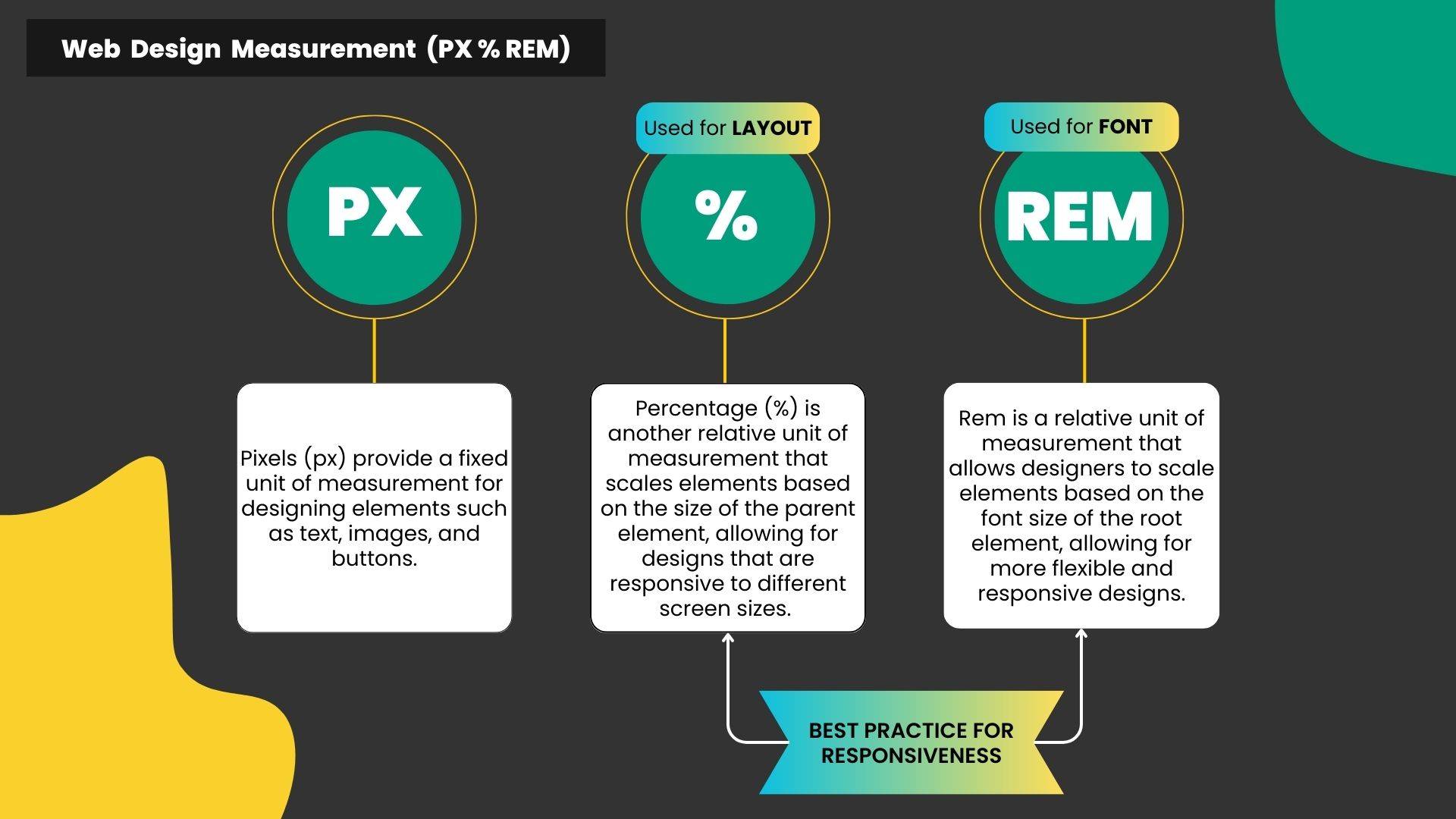
- Web Design’s Unit Measurement (px, REM, %).
- Style properties on the desktop are inherent to tablet and mobile views.
- Adjusting Flexbox layout on mobile.
- Adjusting Grid layout on mobile.
- Change the order of the elements in tablet and mobile views.
- Hide elements in mobile and tablet views.
I started the video above with some intro on web design unit measurement. In this course, it is not obligated to use REM over PX for fonts. You have the freedom to use either unit measurement you like.
There are two different ways to responsively arrange your elements on tablet and mobile views depending on whether you are using flexbox or grid layout.
1. Flexbox Container Wrapping
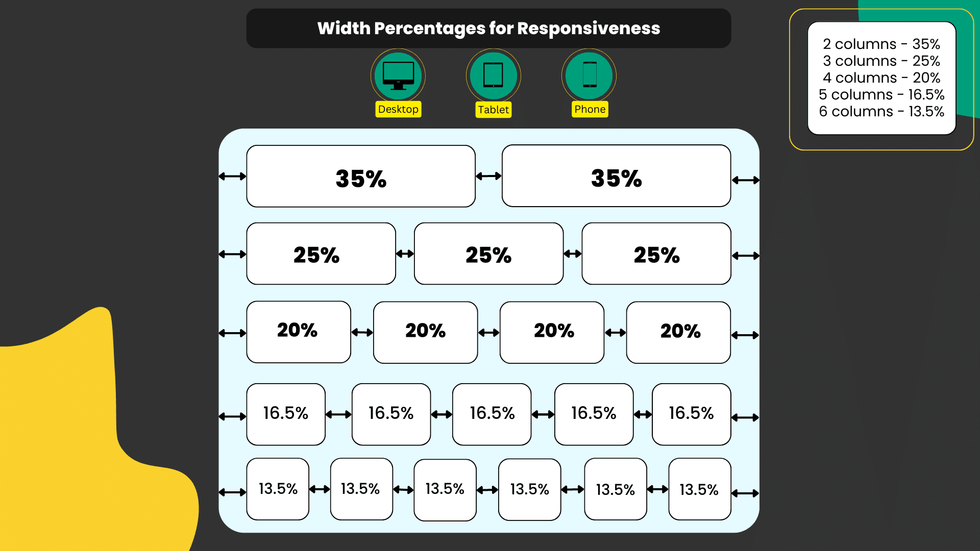
To apply the width percentages in the diagram above and get the intended responsive results, you have to apply the following container settings:
- Wrapping is enabled
- Desktop view: Container's content width: Boxed
- Direction: Horizontal
- Justify Content: Center
- Gap between elements: 20px or default
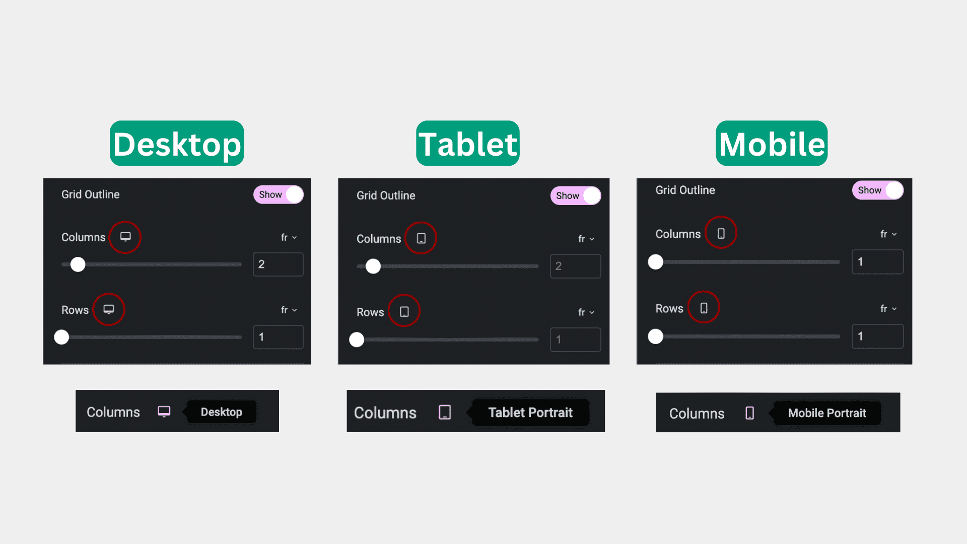
2. Grid layout
For Grid layout, it’s easier.
Just set how many columns and rows you want for each view screen (desktop, tablet & mobile)
Resource Guide From Elementor
Additionally, you can find the official tutorial & guide resources from Elementor as follows:

Hello everyone, feel free to ask any question here 🙂
ada buat servis untuk buat landing page?
some of the video is not working
If you encounter any video playback problems on your mobile device, please consider viewing this course on laptop, or desktop. We are actively addressing issues to enhance the learning experience.
I have reconfigured the streaming zone, kindly let me know if the issue persists
Which is the difference between the 2 services that they provide, one is PAGE SPEED BOOSTER and the other one is PLATFORM, how to know which we should pick.
Hi Raul, good question. Page Speed Booster is for those who host their WordPress website with another hosting provider, while the platform itself includes hosting and Page Speed Booster as part of a single package in their offerings.If you wanted to use the AI builder, you should opt for the platform package 🙂
So if I choose page speed booster it means I have to have 2 hosting
to clarify, speed booster package does not include 10Web hosting, the AI builder is only available for the platform itself